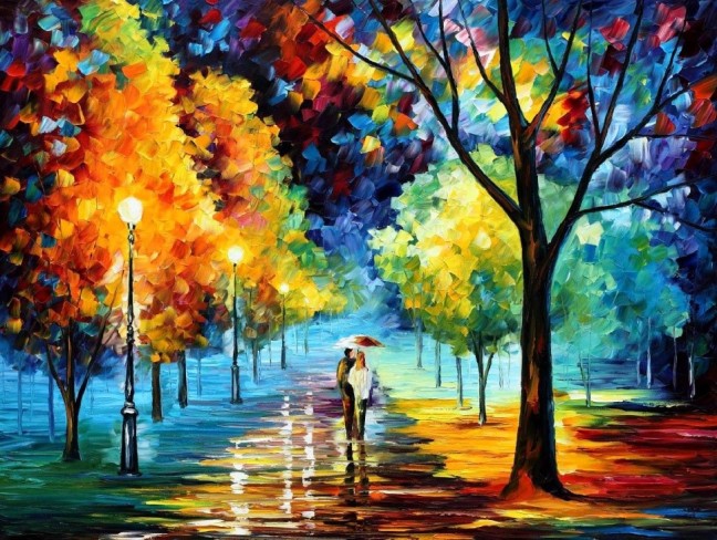
This is a palette knife oil painting on canvas called “night alley” by Leonid Abramov.
This painting is good. The way I see this picture is I see two different emotions. Happy which is shown by the warm colours and sad which is shown by the cool colours. It shows that if you follow the right path you will stay in the light and if you don’t then you will fall into the dark. The people in pictures have followed the right path therefor are having a happy life. However, when you look at the Harrison point the colours go to cool colours again showing that even if you follow the right path you can still fall into dark places. This picture can also be seen as a spooky picture as it shows the path is safe but once you move of the path it becomes a lot darker and sinister showing again that if you stick to the right path it will all be okay. Also because the lady has an umbrella in the image it shows that she is shielded in the dark areas and is protected from the negatives in life.
Also from the colours the artist never uses just one colour throughout the whole image this means that you always have more than one thing to focus on.
The lighting in this mage can also be shown for a horror game as the path is your safe spot and the area where you are safest from any enemas whereas once you leave the path this is where you can easily be picked off. You could create this image on Maya to create a night alley.
The strokes of the paint brush don’t go the same way throughout the photo which adds to the effect. Also makes the drawing look so much better. As the flick of the brush shows the leaves and really makes the trees look effective. Also the way the artist has made the reflection of all the colours on the path looks amazing! It really shows the skill of the artist. He uses different colours on the path as well to show the different textures and surfaces.
The way the artist has also made the path go into the distance is also very effective but simple. It shows there is more to the picture then what you first think. The street lights are also effected by the horizon point and as you look at the image you see the lamps get smaller as they get further away. This adds realism to the image as it almost gives the image a 3D view. The trees are also get smaller as the image goes on which again adds realism to the image.
In conclusion, this image is a picture of two paths a happy one and sad one. The image also shows hope and proves that there is always light even in the dark. It is also a very colourful image and is very nice to look at. The techniques used are also used to make the image look realistic for example the horizon point.This is a palette knife oil painting on canvas called “night alley” by Leonid Abramov.
This painting is good. The way I see this picture is I see two different emotions. Happy which is shown by the warm colours and sad which is shown by the cool colours. It shows that if you follow the right path you will stay in the light and if you don’t then you will fall into the dark. The people in pictures have followed the right path therefor are having a happy life. However, when you look at the Harrison point the colours go to cool colours again showing that even if you follow the right path you can still fall into dark places. This picture can also be seen as a spooky picture as it shows the path is safe but once you move of the path it becomes a lot darker and sinister showing again that if you stick to the right path it will all be okay. Also because the lady has an umbrella in the image it shows that she is shielded in the dark areas and is protected from the negatives in life.
Also from the colours the artist never uses just one colour throughout the whole image this means that you always have more than one thing to focus on.
The lighting in this mage can also be shown for a horror game as the path is your safe spot and the area where you are safest from any enemas whereas once you leave the path this is where you can easily be picked off. You could create this image on Maya to create a night alley.
The strokes of the paint brush don’t go the same way throughout the photo which adds to the effect. Also makes the drawing look so much better. As the flick of the brush shows the leaves and really makes the trees look effective. Also the way the artist has made the reflection of all the colours on the path looks amazing! It really shows the skill of the artist. He uses different colours on the path as well to show the different textures and surfaces.
The way the artist has also made the path go into the distance is also very effective but simple. It shows there is more to the picture then what you first think. The street lights are also effected by the horizon point and as you look at the image you see the lamps get smaller as they get further away. This adds realism to the image as it almost gives the image a 3D view. The trees are also get smaller as the image goes on which again adds realism to the image.
In conclusion, this image is a picture of two paths a happy one and sad one. The image also shows hope and proves that there is always light even in the dark. It is also a very colourful image and is very nice to look at. The techniques used are also used to make the image look realistic for example the horizon point.cgcg
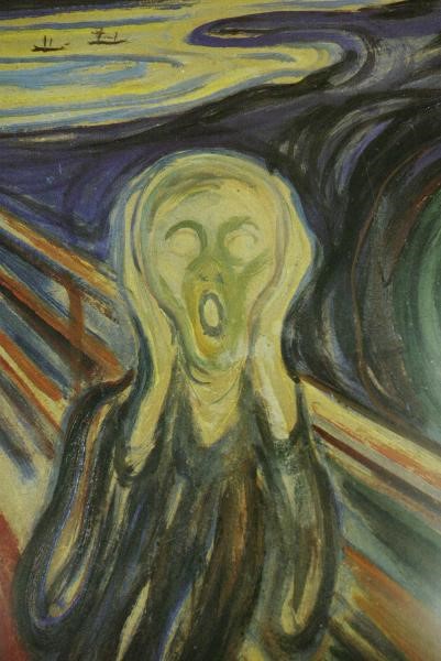
This painting is a very famous one by Edward Munch the image can come across very confusing and it can take you time to actually figure out what the picture is actually about, but this is what makes the image so unique and interesting. You don’t know where to lay your eyes. However, when It comes to how the artist has painted the image. The artist has used very dark and inhuman colours showing that this is not a healthy or normally piece. All the colours that are used in the painting are very dark and depressing setting the tone of the picture and laying down the emotion fixed in the paint. The colours used for the background are mainly black and purple with the storks of the brush heading for the figure, showing that the being is facing a traumatic event. We know this as black is a colour mainly represented with death and misfortune. The water in the background is not shown with its normal blue colour. It is shown with a dirty yellow colour adding in dramatic effect and because water is normally made to seem as a safe haven when running away from wildlife and monsters, this colour shows that not even the water is safe and there is no escape for the protagonist. The beings face is pale and white which is mainly associated with being spooked and seeing ghosts. This can therefore show that the figure is going through a stressful time. We can also see what seems to be the figures skin through it rags, showing that he is not a wealthy person and could be seen as a homeless person. Showing that the thing has not place of comfort and has no means of escape. The fence behind even has a fair bit of yellow creeping around on it, the colour is similar to that of the water. This again shows that even the only object spreading the figure from the dark areas around him is not safe and is not a safe heaven.
Even though we can see a lot of emotion from the colours used in the image a main focal part of the image is the facial expression shown by the person. This is smack bang in the middle of the image, meaning this is the main area that the artist wanted you to look at. The facial expression clearly shows the being is stressed and is looking at something that is terrifying him. We can see this by the wide eyes which are normally shown with being aware and spooked. Similar to when a cat is scared it tends to have wide eyes. This can be turned back to the image and show the terrified look in the protagonist’s eyes. Also the shape of the person’s mouth is not shown as a smile or even a shocked face. We can see that he is terrified due to the fact his mouth is wide open and this is associated to shock and paranoia and terror. So from this we can see that the image is not intended to be a nice and friendly image rather than a disturbing one.
From everything I have picked up from this image in my opinion I can see this image very much related to mental illness like depression. This can therefor make the image very relatable to many people therefor making it an even better piece of art work. The reason I say it can be related to mental illness is because when you have these problems you feel scared and you feel as if you are trapped this can be related to the persons face and the fence blocking him from the rest of the world. You can even feel as if everyone is against you and closing in one you. This can be tracked back to the black and purple streaks closing in on the person. Even the water seems to be against the figure which again makes me feel that this can be related to mental illness. This shows that the figure probably isn’t being scared by anything at all but is facing a hard time in his life and he is just seeing all these images around him.
In conclusion, from viewing this image you can tell it is not a nice painting and can be very disturbing. You can tell the person is going through a very traumatic time in their life, we have seen this through the different colours and the person very terrified facial expression. From this we can also relate this image to mental illness.
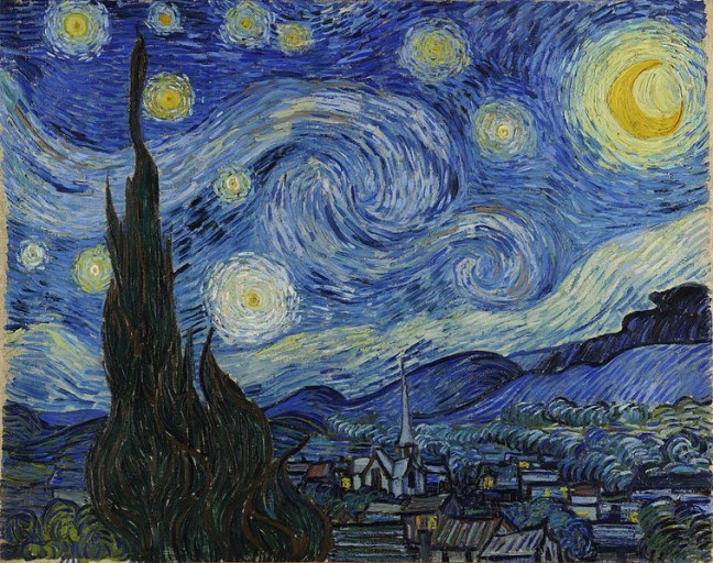
This image by Van Goth called “starry night sky” is a very unique piece of work by a very famous artist. The colours used in this image are very much ranged and can be very different but that again sets the image apart and makes it unique. Even the night sky can be seen as very spooky the Stars and the lights in the windows of the house creates a lot of comfort. The steeple dominates the image and is the main focus point of the whole village. The colours are very dark and are mainly blue. This is because the main vocal image is the sky this shows that the artist wants us to mainly look at it. However, the choice of colour has also been very much debated, especially due to the fact he mainly uses yellow in this image. It is believed that he was suffering from lead poisoning or a type of brain disease and this would explain his strange choice of colour. The choice of white and yellow is good, this is because it draws attention to the sky. The vertical line of the tree and the church tower safely break up the difference between the sky and the ground. This makes sure it doesn’t take the attention from the sky.
In this image Van Gogh use of lighting shows the contrast between life and death with the dark sky and the stars in the sky, and the village. The main light sources are the stars and the moon.
This Image shows a lot of emotions. However, the main emotion shown by this image is hope This can be shown that even with the dark night you can still see light I the windows of the houses. Furthermore, the shining stars filling up the sky. There will always be light to guide you even if you are in the darkest of places. This image can help people find the heaven.
The Grass in the image has a dark colour showing that it is not facing the light source. It also makes the image look a lot more realistic because it almost shows the painting is like a photo taking by a camera. This then allows the picture to be more relatable to photographers and this then makes this image more popular in the community. The tree is also typically associated with mourning.
In the night sky we can see the artist has used his paint brush to separate two parts of the paint. This makes the image realistic as it shows natural forces which is obviously in natural day life. The swirling sky also moves the views eye around the painting. The space between the sky also shows a Dot to Dot effect. This image is mainly used to show emotion
In conclusion in this image we can see that it is mainly there to show hope and prove that even if you are in a dark area there is still hope. Also light will always find you no matter what. The image also shows comfort. Even though the choice of colour is very strange it still works and the image is very easy to look at.
 PEGI where introduced to the Film and game industry to project viewers from the film or game that they will see. Games are rated depending to the content they contain. PEGI ratings will help parents decide whether to let they children play a game or not.